
 Less is more when it comes to health care utilization and outcomes. The U.S. allocates too many resources to a huge line item of waste in the health system – administrative (in terms of too many paper processes and staff to deal with them) and clinically (especially involving duplicated tests and ineffective treatments that aren’t based on evidence based medicine).
“Take less” is the tagline of the company called help which is found at the URL http://www.helpineedhelp.com/.
This is a consumer-facing over-the-counter drug supplier. Their product line counts 7 mature products each packaged with the health complaint they target: “Help,”
- I have a headache = acetaminophen
- I have an aching body = ibuprofen
- I’ve cut myself = adhesive bandages
- I have a blister = hydrocolloid bandages
- I have allergies = loratidine antihistamine
- I can’t sleep = diphenhydramine
- I have a runny nose = phenylephrine nasal congestant.
The packaging measures about 3.25″ square and weighs virtually nothing to carry around in a pocket, handbag, backpack or business case. Packaging is biodegradable, bioplastic, and made from paper pulp. Each package contains 16 doses of the product.
Thus, help also means “less,” as a business philosophy: less waste and less dyes. But “less” to the help team also means less greed, less self-indulgence, less confusion, and less drugs.
The product line is carried at several retail pharmacy chains: I’ve seen it in Target and Walgreens nationally, and Duane Reade in NYC. It’s also found in some of my favorite consumer brand companies such as Virgin America and Morgan Hotels, among other retail channels.
Health Populi’s Hot Points: Start with the importance of design: help’s packaging and overall concept is smart, clean, rational, and sensible at this point in economic time. Its philosophy of less-is-more and objective to lessen confusion are welcome corporate objectives in an era of too-much-healthcare and Overtreatment (click on the link to read more about Shannon Brownlee’s treatise on the subject, Overtreated).
![]() I was delighted to discover this product line at my local Target store at a very visible end-cap in the pain meds aisle. Target is already an important force in well-designed health products and services. I waxed lyrically about Target’s Design of the Decade award from ISDA for the chain’s safe prescription pill bottles in December 2010 – elegantly designed, and targeting the significant public health problem of medical errors.
I was delighted to discover this product line at my local Target store at a very visible end-cap in the pain meds aisle. Target is already an important force in well-designed health products and services. I waxed lyrically about Target’s Design of the Decade award from ISDA for the chain’s safe prescription pill bottles in December 2010 – elegantly designed, and targeting the significant public health problem of medical errors.
The help team has the opportunity to apply their smart precepts of great design and consumer engagement for other health products and services. They cut through confusion by being elegantly simple and clear, stating the clinical problem in a clean large font, along with the dose of the meds. The Drug Facts label on the back of the package is clear and states, “Help I have an aching body is a drug, not a sweet candy treat. We wouldn’t try to trick you by coating it with sugar.”
This offering represents the new breed of highly engaging products targeting the empowered DIY healthcare consumer.
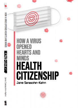
 Jane joined host Dr. Geeta "Dr. G" Nayyar and colleagues to brainstorm the value of vaccines for public and individual health in this challenging environment for health literacy, health politics, and health citizen grievance.