
Many people living in America who receive health benefits at the workplace traded off wage growth for health insurance coverage, a report from the Federal Reserve Bank of New York published this week.
For those of us working in the health economics and policy space since the 1990s, the Fed team gave me a strong sense of déjà vu.
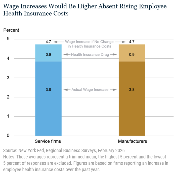
The bar graph cited in the report explains the math behind the wage/health plan trade-off.
“Among those businesses experiencing an increase in employee health insurance costs, the average wage increase over the past year was 3.8 percent for both service firms and manufacturers, slightly higher than the 3.4 percent reported among all firms in the surveys,” the Fed research team explained. “However, these firms reported that the average wage increase they would have given to their workers if health insurance costs had not gone up was about 4.7 percent. Thus, wage growth for workers at these service and manufacturing firms would have been about one percentage point higher, on average, if health insurance costs had held steady—the equivalent of a 20 percent drag on wage growth,” the Fed team calculated.
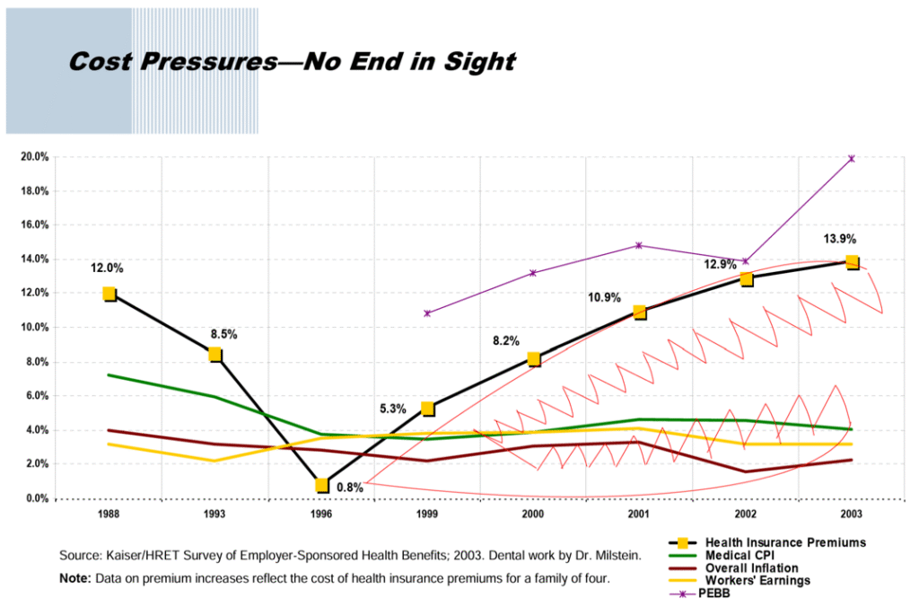
When I first saw this second chart in 2006, a few months before launching the Health Populi blog, I had seen Dr. Arnie Milstein, then leader of the Pacific Business Group on Health, speak about the “shark teeth” on the right side of the line graph which tracked the rise of workers’ wages with the rise of health care costs (embodied in health insurance premium costs) from 1988 to 2003. (Note Hill’s witty sourcing on the bottom of the chart noting “Dental work by Dr. Milstein”).
The gap between the northern line (health care costs) and southern line (workers’ earnings) represented the “bite” taken out of working peoples’ financial hides trading off health care insurance coverage for pay-at-work.
Matthew Holt wrote about this in The Health Care Blog in 2006, and it was Matthew (my longtime working brother-from-another-mother) I turned to as digital archaeologist to dig up this historic chart we both have been referring to all these years.
I re-discovered the version of the chart you see here in a 2005 presentation by Steven Hill, the former Administrator of the Washington State Health Care Authority. The title of Hill’s deck was “Improving Health Care Quality and Cost in the State of Washington.” Again, let me repeat this was content Hill presented 21 years ago as part of the Governor’s Work Group on Health Care Quality and Cost.
Hill included the shark-bite chart shown above as the first exhibit in the report, providing the context for “why” the State of Washington wanted to address health care cost, quality, and access for the state’s health citizens.
Fast-forward to the Federal Reserve’s report, from which I clipped the first chart. This is our current state of wage-health cost trade-off for American workers, a uniquely American phenomenon experienced by employees covered by health insurance at the workplace for many of the past three decades.
“Wage growth has slowed every year since 2022, likely reflecting the effects from lower inflation pressures and a cooling of the labor market over the last few years. Among service firms, the average wage increase slowed from 4.5% in 2022 to 3.4% in 2025, and among manufacturers, from 6.3% in 2022 to 3.4% in 2025. Wage growth is expected to slow further” in the years ahead, the Fed forecasts.
The team cited the research of Kaiser Family Foundation’s 2025 Employer Health Benefits Survey, calling out key contributing cost drivers including the higher cost of hospitalization and physician care, as well as the high cost of providing GLP-1 and other prescription drugs.
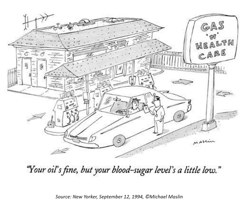
Health Populi’s Hot Points: Here’s a New Yorker cartoon by Michael Maslin that I’ve used in my work since it was published in 1994.
I talked about déjà vu at the start of this post: I’ll point out that the first post I wrote when I launched the Health Populi blog in 2007 addressed the price of gas and health care in America, citing the kitchen table budget line item of filling up a car’s gas tank at the time when the prevailing price per gallon in the U.S. averaged $2.81, and in many metro markets exceeded $3.00.

As consumers in the U.S. now face fast-rising gas prices in the context of trading off wages for health care, we find ourselves back in the world of Tom’s Shell petrol station who advertised the prices, cash or credit, as “ARM” for regular, “LEG” for plus, and “First Born” for premium petrol.
Like I said, déjà vu all over again….with Health Populi sounding like a broken record on the topic of consumers as health care payors who feel quite disenfranchised in a geo-politically charged year.
Watch out for your local incarnations of Tom’s Shell petrol pricing…given the state of the health consumer and medical bills, “Arms, Legs, and First Born” were a prescient projection by the Tom’s Shell station owner.

 Thank you
  Jane joined host Dr. Geeta "Dr. G" Nayyar and colleagues to brainstorm the value of vaccines for public and individual health in this challenging environment for health literacy, health politics, and health citizen grievance.